aus_arrivals |>
    group_by(Origin) |>
    mutate(LaggedArrivals = lag(Arrivals)) |>
ungroup()4 Transformations
Just like with data in supervised learning, we can perform transformations on time series data to make certain patterns more explicit or to facilitate modeling. In this chapter, we describe some of the most common transformations. We first introduce some notation, denoting a time series via
\[ x_1,x_2,x_3,\ldots \]
More generally, we use \(x_t\) to denote the value of the time series at time \(t\). We let \(y_t\) denote the value of the transformed time series. To denote entire the entire sequence of time series values, we put parentheses around the values, i.e. \((x_t)\) and \((y_t)\), with \(t\) now denoting a dummy index. More formally, we can regard transformations as mappings from a space of sequences to another space of sequences.
4.1 Lags
For any positive integer \(k\), the \(k\)-th lag of a time series \((x_t)\) is defined by \(y_t = x_{t-k}\). In other words, we shift the values of the time series \(k\) units into the future. The lag for a time series (or any vector) is computed via lag(). When working with tsibble data, one may need to combine this with a mutate to generate new columns.
Lag transformations are important for discussing autoregressive behavior of time series. Furthermore, when studying the relationships between multiple time series, the behavior of a given time series (e.g. the number of foxes at month \(t\)) may depend more strongly on the behavior of a lagged verison of the time series (e.g. the number of rabbits at month \(t-1\)) rather than on present values.
Indeed, the lag transformation is so important that there is standard notation for how to denote it: We define the backshift operator \(B\) as the mapping: \[ B((x_t)) = (x_{t-1}). \]
4.2 Differencing
The (first) difference of a time series is defined as \(y_t = x_t - x_{t-1}\). Taking the first difference can be thought of as a discrete version of differentiation. 1 This leads to natural interpretations of differenced series. If the original time series measures the distance of a person from a fixed position, then the differenced series measures their (discretized) velocity. More generally, the first difference has the units of a rate. Higher order differences can be computed by taking repeated first differences, and have an analogous interpretation as higher order derivatives. Differences of order greater than 2 are rarely appropriate for real datasets. One may also wish to compute seasonal differences, i.e. of the form \(y_t = x_t - x_{t-s}\) where \(s\) is the period of the seasonality. Differences can be computed using the difference() function from tsibble.
4.3 Log transformations
A log transform sets \(y_t = \log(x_t)\). In the context of time series data, it can produce several benefits. First taking logs can dampen heavy tails, reduce sensitivity to outliers, and stabilize variance. This is particularly important because time series are often non-stationary2 and can exhibit changing variances over time. Constant variance is an assumption for many modeling approaches.
Secondly, log transformations are often used to focus on percentage changes. For instance, if \(x_t\) is a stock price, then the time series \(y_t = \log(x_t) - \log(x_{t-1})\) is called the log returns of the stock, and approximately measures the percentage change of the stock price during the time interval between \(t-1\) and \(t\). As the time interval becomes smaller, the approximation becomes more and more exact. Financial models usually work with log returns.
Furthermore, log transformations convert multiplicative relationships between different time series into additive relationships, which are easier to model.
4.4 Box-Cox transformations
A Box-Cox transformation is a one-parameter family of transformations that are used to stabilize variance. The formula depends on a scalar parameter \(\lambda\) and is as follows: \[ y_t = \begin{cases} \log(x_t) & \text{if}~\lambda = 0, \\ (\text{sign}(x_t)|x_t|^\lambda - 1)/\lambda & \text{otherwise}. \end{cases} \]
When \(\lambda=1\), this is just a downward translation by 1 unit. As \(\lambda \to 0\), one can use L’Hopital’s rule to show that the function converges to \(\log\). In other words, Box-Cox transformations interpolate between the two extremes.
One chooses the parameter \(\lambda\) so that the fluctuations throughout the time series have similar variance. This can be done automatically by using the guerrero() function from feasts. See Chapter 3.1 in Hyndman and Athanasopoulos (2018) for an example of how such a transformation is applied.
4.5 Aggregation and downsampling
One may want to aggregate a time series over larger time units in order to get lower frequency data. For instance, instead of considering hourly energy useage, one may want to sum up the usage in a given day to get a time series of daily energy usage. Consider the following two plots of the energy demand in Victoria, Australia in January 2013. The original dataset contains half-hourly data, which is plotted in the top panel, while we have also aggregated the data by day. The aggregated time series makes it easier to observe flucutations of the eletricity demand on time scales larger than a day.
elec_filtered <- vic_elec |>
    filter(year(Time) == 2013, month(Time) == 1)

plt1 <- elec_filtered |>
    autoplot(.vars = Demand)

plt2 <- elec_filtered |>
1    index_by(Date = date(Time)) |>
2    summarise(Demand = sum(Demand)) |>
    autoplot(.vars = Demand)

grid.arrange(plt1, plt2, nrow = 2)- 1
-
index_by()is the analogue ofgroup_by()for tsibbles. Here it is used to create a new index variableDate. - 2
-
summarise()computes the sum ofDemandfor all measurements with sameDatevalue.
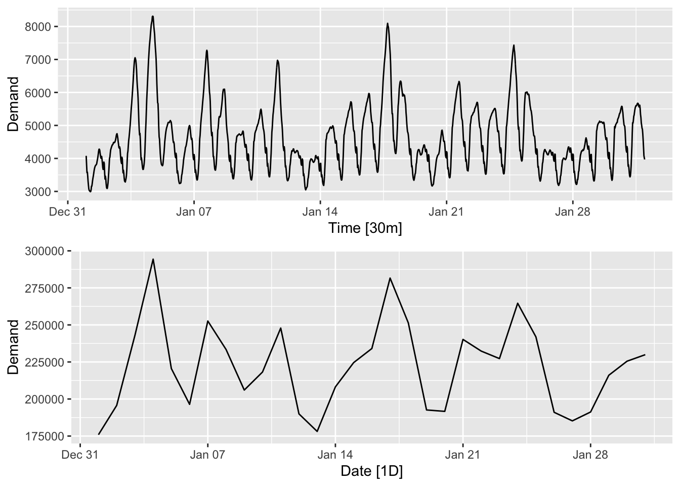
Downsampling involves sampling a time series at fixed intervals. This is done for data compression reasons, especially when the time series does not vary too much between the sampled points.
4.6 Moving averages
Aggregating time series can smooth out otherwise distracting fluctuations. However, rather than aggregating over non-overlapping windows such as days, it may often be more useful and accurate to do so over rolling windows.
A (two-sided) moving average with window size \(m = 2k+1\) is defined as \[ y_t = \frac{1}{m}\sum_{j=-k}^k x_{t+j}. \]
When using moving averages for forecasting, it may be more appropriate to use a one-sided moving window. This is defined as \[ y_t = \frac{1}{m}\sum_{j=0}^k x_{t-j}. \]
A moving average transformation is sometimes called a moving average filter. Let us apply it to the energy demand time series discussed in the previous section.
library(slider)

elec_filtered <- vic_elec |>
1    mutate(DemandMA48 = slide_dbl(Demand, mean, .before = 24, .after = 23)) |>
    filter(year(Time) == 2013, month(Time) == 1)

elec_filtered |> autoplot(Demand) +
geom_line(aes(y = DemandMA48), color = "red")- 1
-
slide_dbl()from thesliderpackage is combined withmutate()to create the moving average time series..before = 24and.after = 23set the window to be 24 units in the negative direction and 23 units in the positive direction. Here, we have used an asymmetric window so that the daily seasonality is completely averaged out.
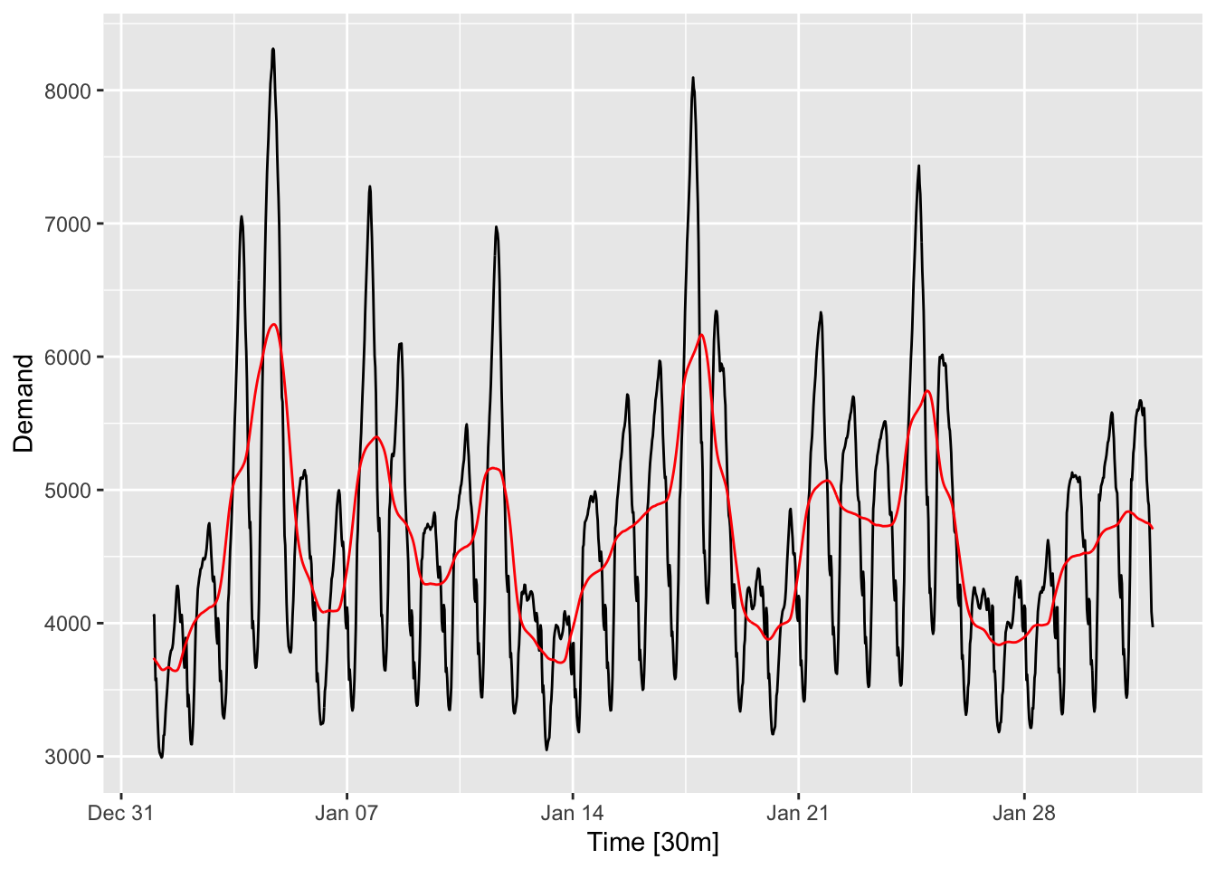
The moving average time series is plotted in red. Observe that the daily fluctuations have been averaged out. Comparing it to the bottom panel of Figure 4.1, we see that this series remains more smooth than the daily aggregated time series.
Note that the window size refers to the number of terms averaged over when taking the moving average. It is a hyperparameter that can be tuned—the larger the window size, the smoother the moving average, but the more different it will be from the original time series.3 One can also use weighted moving averages. For more information, check out Chapter 3.3 in Hyndman and Athanasopoulos (2018).
4.7 Rolling window transformations
We have seen the benefit of computing the mean over rolling windows of measurements. It is also sometimes useful to compute other summaries over rolling windows. One example is to compute the standard deviation over the window, as shown in the example below for google stock prices.
goog <- read_csv(str_c(CLEANED_DIR, "GOOG.csv")) |> as_tsibble()
goog_rolling <- goog |>
    mutate(CloseMA21 = slide_dbl(Close, mean, .before = 10, .after = 10),
           CloseSd21 = slide_dbl(Close, sd, .before = 10, .after = 10))

plt1 <- goog_rolling |>
    autoplot(Close) +
    geom_line(aes(y = CloseMA21), color = "red")

plt2 <- goog_rolling |>
    ggplot() +
    geom_line(aes(x = Date, y = CloseSd21), color = "blue")

grid.arrange(plt1, plt2, nrow = 2)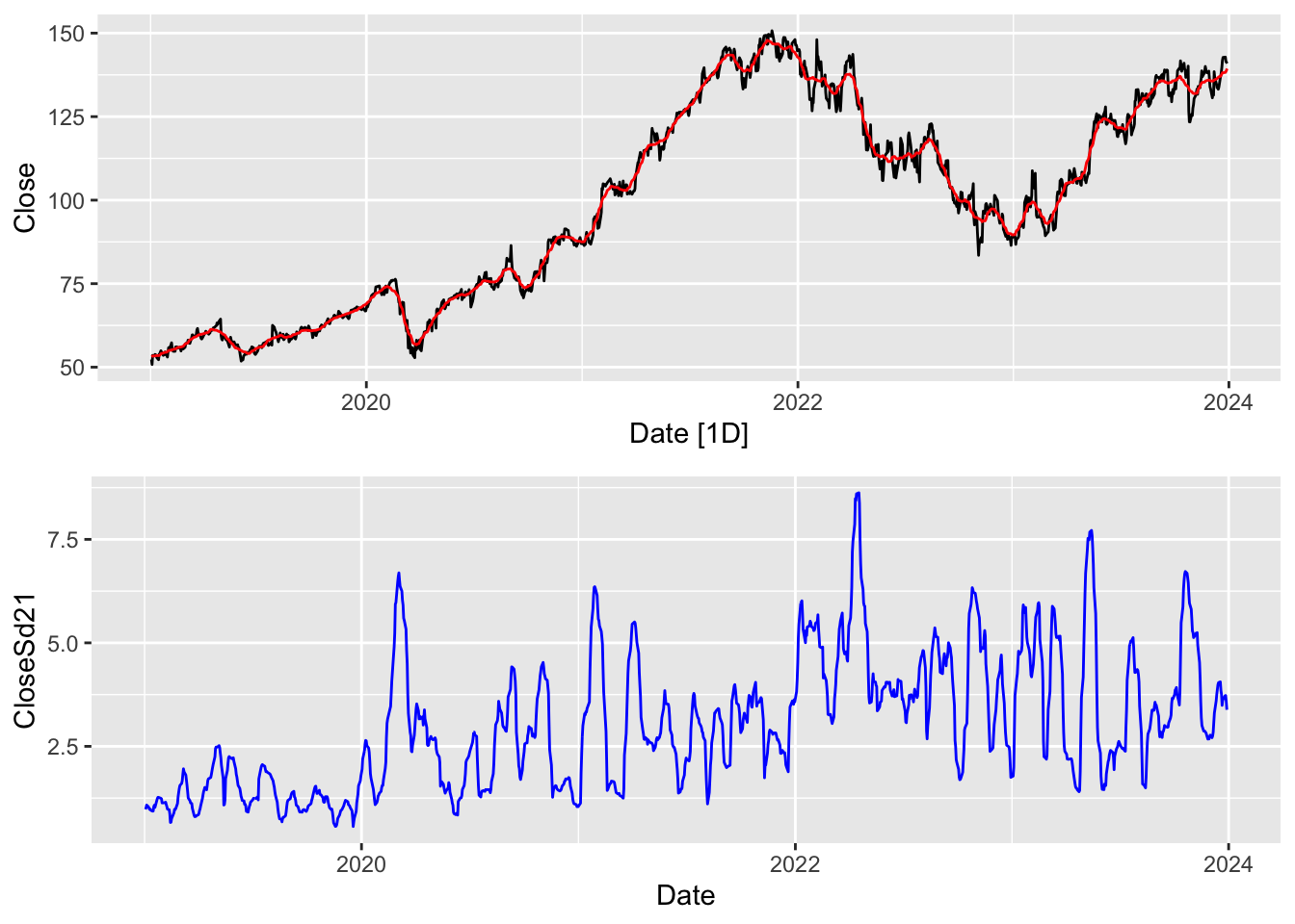
Here, in the top panel, we have plotted the actual daily closing stock price (black) as well as a 21-day moving average in red. In the bottom panel, we have plotted the 21-day moving standard deviation in blue. Note that the behaviors of the two transformations can be quite different. The rolling window standard deviation measures how “jumpy” the time series is in a region around that time point. In the language of finance, it measures the volatility of the time series at that point.
The rolling window standard deviation is computed by changing the second argument in slide_dbl() from mean to sd. In general, one may apply any summary function (a function that takes a vector and returns a scalar).
Linear functions already comprise a large class of useful functions that can be used in rolling window transformations. These give the formula \(y_t = \alpha^Tx_{t-k:t+l}\), where \(x_{t-k:t+l} = (x_{t-k}, x_{t-k+1},\ldots,x_{t+l})\) and \(\alpha = (\alpha_1,\alpha_2,\ldots,\alpha_{k+l+1})\). In this case, \(\alpha\) is called a linear filter. The transformation it applies is also called a convolution (with the coefficient vector \(\alpha\)). Convolutions can be generalized to higher dimensions andn are used in deep learning for processing both sequence data (such as time series) as well as image and video.
4.8 Calendar adjustment
Some of the variation seen in monthly time series may be due to the fact that there are different numbers of days in different months. Removing these can make the data simpler, and simpler patterns usually lead to more accurate forecasts. The process of removing this variation is called calendar adjustment.
The following is a time plot of monthly milk production on a farm between 1962 and 19754.
milk <- read_rds(str_c(CLEANED_DIR, "milk.rds"))
autoplot(milk, .vars = value)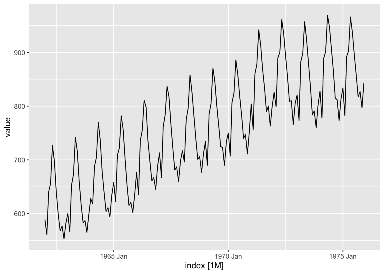
The seasonal and trend effects are strong. However, the pattern is a little jagged at the troughs. What could be causing this?
It is easy to see from the season plot that most of the kinks in the curves arise in months with less than 31 days (Feb, Apr, Sep and Nov).
gg_season(milk, y = value, labels = "left")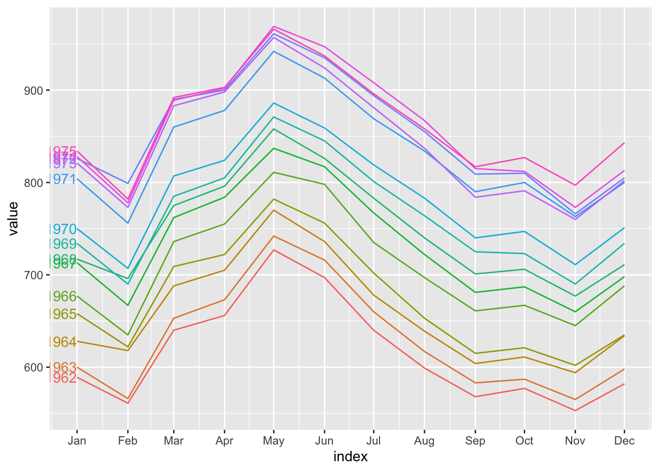
If we were to create a new time series consisting of daily milk production instead of the accumulated production in a month, we can iron out some of the kinks.
mutate(milk, adj_prod = value / days_in_month(index)) |>
  gg_season(y = adj_prod, labels = "left")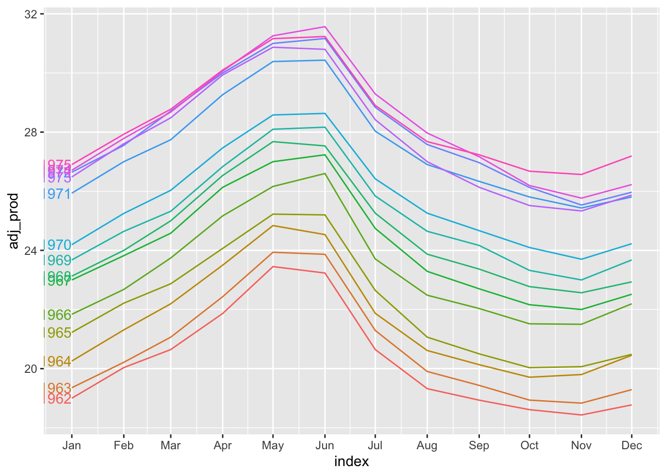
4.9 Transforming multiple time series
So far we have discussed transformations of a single time series. It sometimes make sense to create a new time series based on a transformation of multiple time series. Two such transformations are population adjustment and inflation adjustment, which are discussed below.
4.10 Population adjustment
Any data that is affected by population changes can be adjusted to give per capita values. For instance, the GDP of a country is often divided by its population to yield GDP per capita. This is a more accurate reflection of a country’s economic development. As a second example, suppose we are studying the capacity of the healthcare system and have a time series tracking the number of hospital beds in a country. It may be more useful to compute the number of beds per 1000 residents instead of only considering the total number of beds. If the population is increasing faster than the number of hospital beds, it is in fact possible for the number of beds per 1000 people to be decreasing.
Similarly, when tracking disease counts in a country, it is more important to compute the number of cases per 1000 people living there, not just the total number of cases there. Let’s consider the number of Covid-19-related hospitalisations5 in 2021 in USA and South Africa, which is plotted in Figure 4.7.
Note that the population of USA is approximately 340 million, while that of South Africa is approximately 60 million. Without adjusting for this, the two series look very different in magnitude. After the adjustment, we observe similar peaks/troughs and magnitudes, although the peak in USA comes a little after the one in South Africa.
covid_data_2021 <- read_rds(str_c(CLEANED_DIR, "covid_usa_zaf_fra.rds")) |>
  filter(between(date, ymd("2021-01-01"), ymd("2021-12-31"))) |>
  select(1:4, 20, 21)

plt1 <- autoplot(covid_data_2021, .vars=hosp_patients) +
  labs(x="Month", y="Hospital Patients") +
  scale_color_discrete(labels=c("USA", "South Africa"))

plt2 <- autoplot(covid_data_2021, .vars=hosp_patients_per_million) +
  labs(x="Month", y="Hospital Patients per Million") +
  scale_color_discrete(labels=c("USA", "South Africa"))

grid.arrange(plt1, plt2, nrow = 2)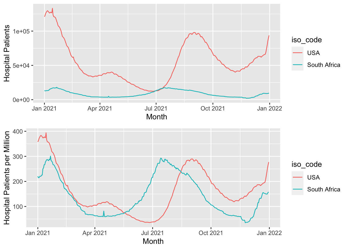
4.11 Inflation adjustment
When working with time series reflecting prices and other money-related quantities, it may be useful to adjust for inflation before modeling. This is because the nominal value of an asset is not the same as its real value. The nominal value refers to the dollar pricetag value of the asset, whereas real value refers to how much of other goods it can be exchanged for. For example, any house you can buy for a million dollars this year is probably much smaller than a house you could buy for the same amount 20 years ago.
Performing inflation adjustment means transforming the time series so that all values are stated in dollar values from a particular year and are hence more comparable in terms of their real value. To do this, we make use of the Consumer Price Index (CPI), which is calculated by government agencies.
Roughly speaking, the CPI for year \(t_1\), relative to year \(t_2\), is computed as \[ \frac{\text{aggregate price of all goods and services in year $t_1$}} {\text{aggregate price of all goods and services in year $t_2$}} \times 100 \]
The aggregation is performed by weighted averaging, based on an estimate of the spending habits of an average household. In Singapore, the CPI is calculated by the Department of Statistics, and can be downloaded from this link. We have already seen it plotted in Figure 1.4, and display it again in the following table. 6
Note that CPI is calculated relative to prices in 2019. The CPI for November 2023 is 114.91. This roughly means that if a household spent $100 on its expenses in 2019, they would have to pay $114.91 to buy the the same type of items in November 2023.
The Department of Statistics also lists monthly retail prices of selected items purchased by households in Singapore. You can download the entire table from this link. One of the items that is tracked is the price of 5kg of Premium Thai Rice. Suppose that \(x_t\) is the unadjusted price at time \(t\) and \(p_t\) is the CPI at time \(t\), relative to 2019. \(t\) would be a particular month, e.g. Jan 2022.
The adjusted price at time \(t\) in “2019 dollars”, \(y_t\), would be: \[ y_t = x_t \times \frac{100}{p_t} \]
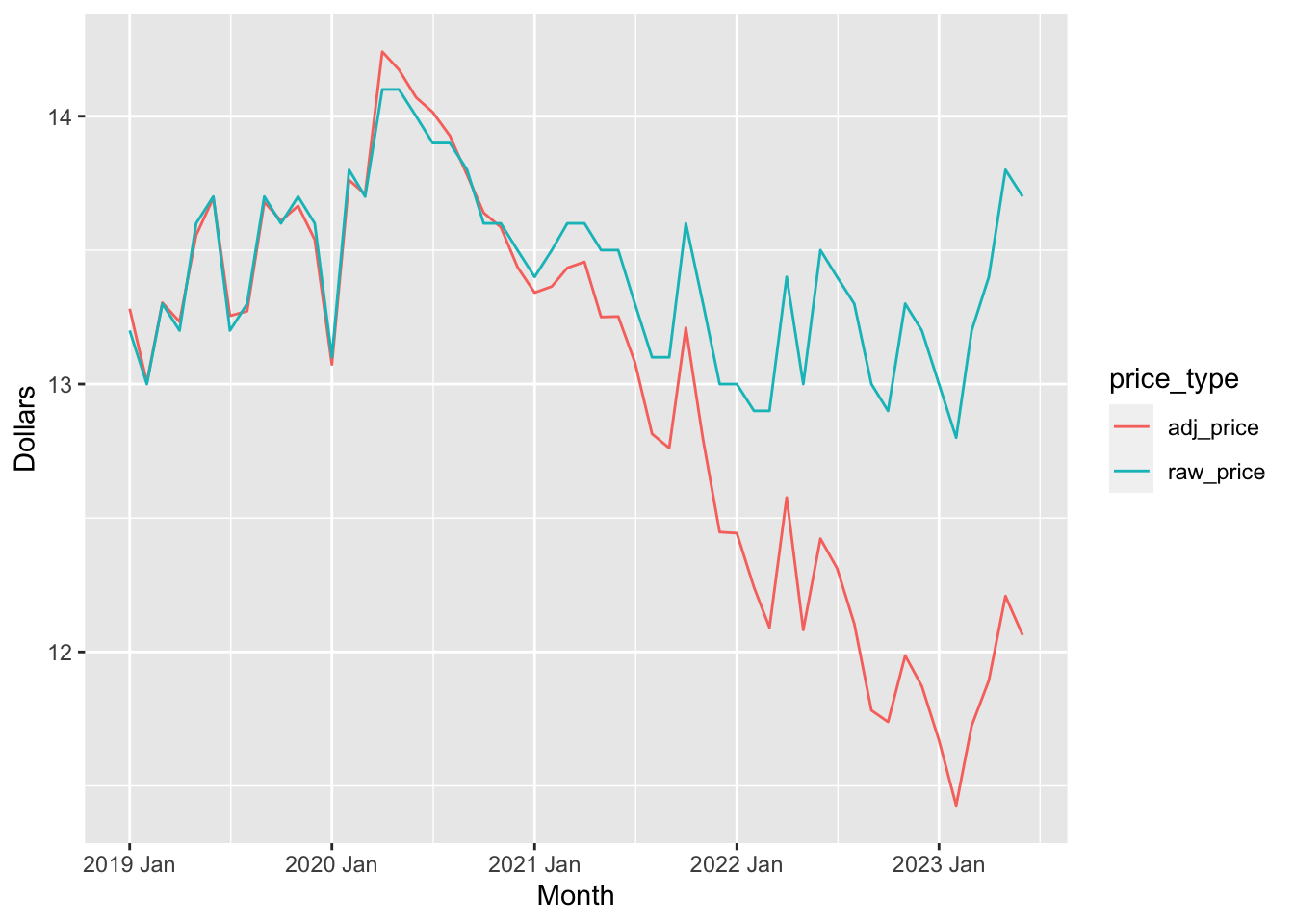
The unadjusted price (in blue) seems to be relatively stable since Jan 2019. However, inflation has been causing the value of the Singapore dollar to drop, which means that rice is actually “cheaper” today than it was 4 years ago in real terms (red).
4.12 Composing transformations
One may compose multiple transformations together to obtain a new transformation of the original time series. We have already seen an example of this in Section 4.3 where we composed differencing and the log transform to obtain log returns.
4.13 Transformations and feature engineering
In supervised learning, creating new columns with the aim of fitting a model on the augmented dataset is called feature engineering. Transformations of time series can be thought of as performing a similar role.
Hyndman and Athanasopoulos (2018) as well as the feasts package allude to something they call “time series features”. These, however, refer to something else, and not to the creation new time series columns. What they mean by “time series features” are more accurately described as summary statistics of a time series. We will discuss this in more detail in Chapter 8.
We don’t have to divide by anything because the time difference is 1.↩︎
We will define stationarity more formally in part 2 of the book.↩︎
This is analogous to bandwidth selection in kernel smoothing for density estimation or regression.↩︎
Data is from the
fmaR package.↩︎Data extracted from Our World in Data↩︎
Separate CPIs can also be calculated for different sectors of the economy. These will calculate aggregate prices for goods and services belonging only to that sector.↩︎