Summary statistics are scalar values that are calculated for a dataset, which help to summarize the dataset. Simple examples include the mean and variance of a collection of independent measurements from a population. Likewise, summary statistics give useful and important summaries of time series data, and can be used for EDA or for confirmatory analysis. In fact, since each time series is treated as a individual “data point” in time series classification, one role for summary statistics is to act as engineered features for this problem.
The feasts package provides many functions for computing useful statistics for time series. Indeed, the name of the package stands for FEatures And Statistics from Time Series.
In this chapter, we work with a fixed length time series \(x_1, x_2, \ldots, x_n\).
Note
Many of the statistics discussed here are ostensibly sample versions of population quantities. However, any reference to a population requires a statistical model for the time series, which we will only discuss in part 2 of the textbook. Whether or not such a model exists, summary statistics for the data can still be computed and can still be useful. For conciseness, we sometimes drop the adjective “sample” when discussing these statistics.
6.1 Mean, variance, quantiles
The features() function from fabletools provides a convenient interface for computing and organizing information about summary statistics. We illustrate this by computing the mean, variance, and quantiles of the time series values in the aus_arrivals dataset.
We create a list comprising the desired summary functions and supply it as the second argument to features().
# A tibble: 4 × 8
  Origin    mean    variance `quantile_0%` `quantile_25%` `quantile_50%`
  <chr>    <dbl>       <dbl>         <dbl>          <dbl>          <dbl>
1 Japan  122080. 4123427340.          9321         74134.         135461
2 NZ     170586. 7170720232.         37039         96520.         154537
3 UK     106857. 4093754355.         19886         53892.          95564
4 US      84849.  884962742.         23721         63950           85878
# ℹ 2 more variables: `quantile_75%` <dbl>, `quantile_100%` <dbl>
Recall that aus_arrivals contains four time series, comprising tourist arrivals from Japan, New Zealand, UK, and USA respectively. features() returns a tibble where each row corresponds to a different time series, and each column corresponds to a different summary function. Note that quantile() automatically calculates all quartiles.
6.2 Autocovariance and autocorrelation
In Chapter 3, we’ve learnt about lag plots, which are scatterplots of a time series against a lagged versions of itself. Just as the correlation coefficient is used to summarize the scatterplot for i.i.d. data, we may summarize lag plots using the concept of autocorrelation.
We first define the (sample) autocovariance function (ACVF). For \(k=0,1\ldots,n-1\), it is defined as \[
\hat \gamma_x(k) := \frac{1}{n}\sum_{t=k+1}^n(x_t - \bar x)(x_{t-k} - \bar x),
\tag{6.1}\] while for \(k = -1,-2,\ldots,-n+1\), we define \(\hat\gamma_x(k) := \hat\gamma_x(-k)\). Here, \(\bar x := \frac{1}{n}\sum_{t=1}^n x_t\) is the sample mean of the time series.
Note that even though there are only \(n-k\) terms in the sum in Equation 6.1, we still divide the sum by \(n\). This ensures that the function \(\gamma_x(-)\) is positive semidefinite, which is a useful property for some downstream analysis.
The (sample) autocorrelation function (ACF) is defined as \[
\hat \rho_x(k) := \frac{\hat \gamma_x(k)}{\hat \gamma_x(0)}
\] for \(|k| = 0, 1, \ldots,n-1\). For each \(k\), \(\hat \rho_x(k)\) is also known as the \(k\)-th auotocorrelation coefficient, and measures the correlation of the time series with the \(k\)-th lagged version of itself. It is clear that the ACF takes values between \(-1\) and \(1\), with larger magnitudes corresponding to stronger relationships.
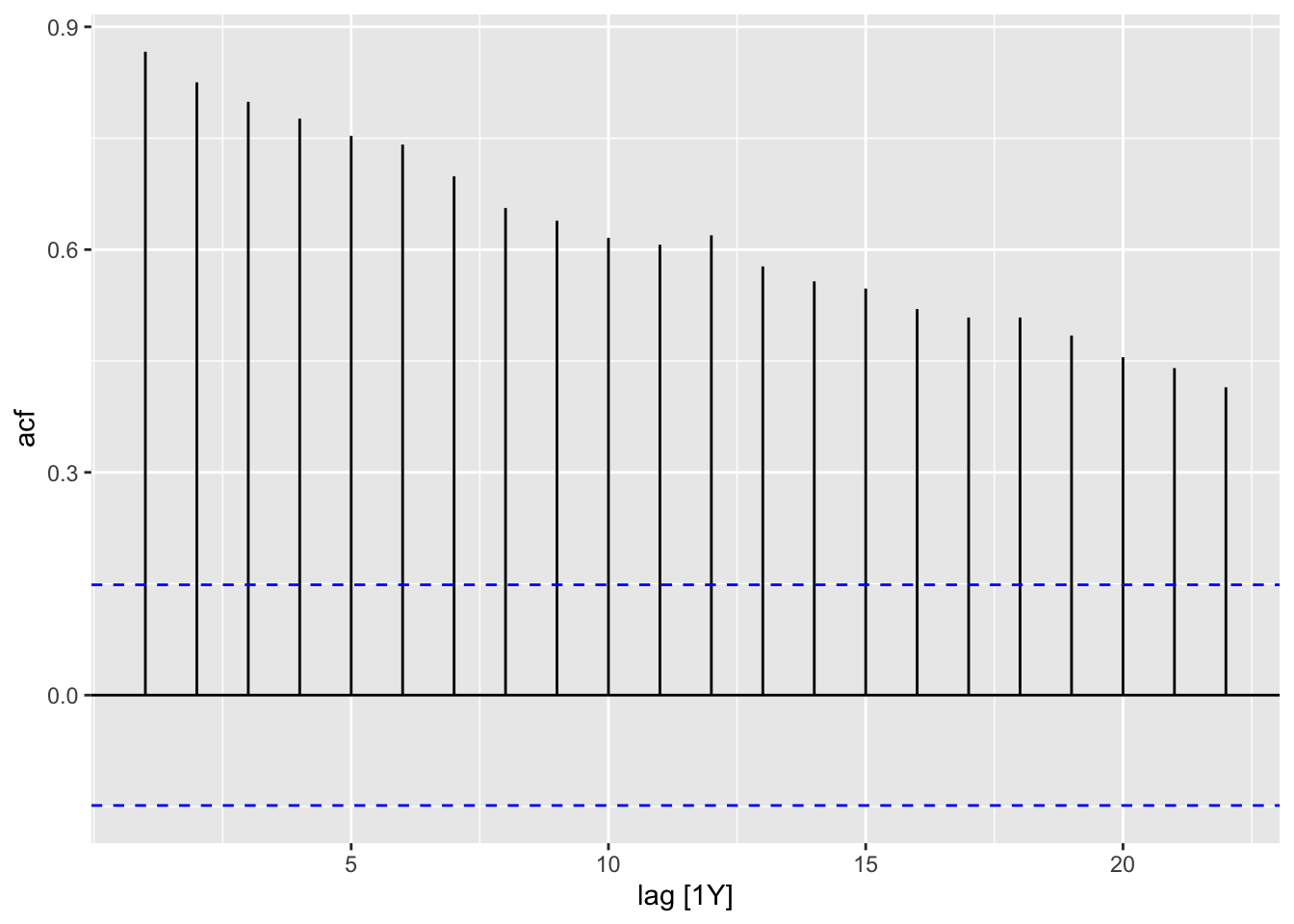
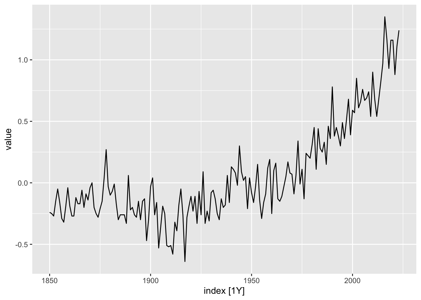
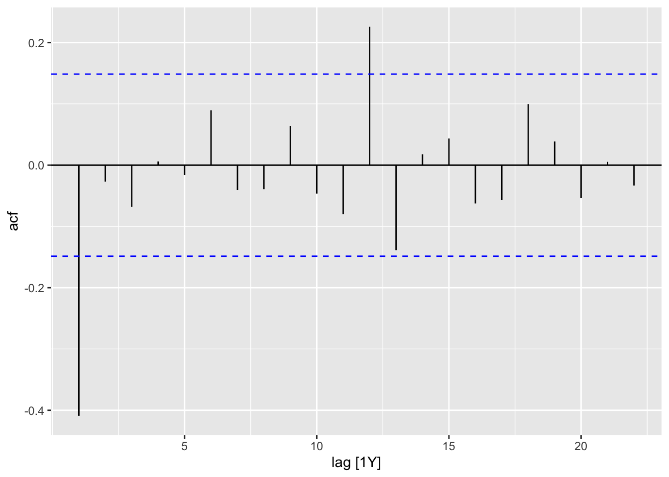
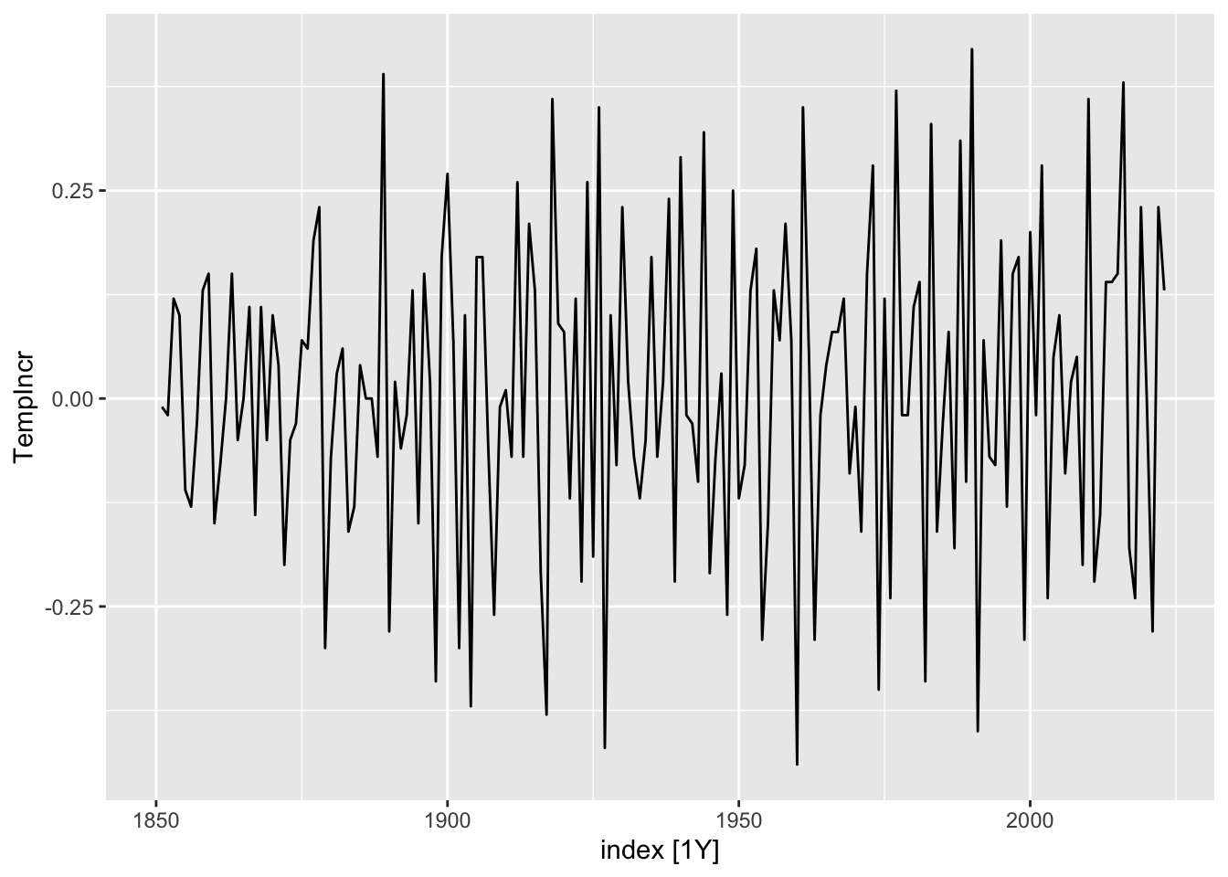
To compute ACVF and ACF values, we may use the function ACF() from feasts. Let us apply this to the gtemp_both dataset measuring global temperature deviations (see also Figure 1.7.)
It is more visually impactful to present this information in the form of a barplot, which we call an autocorrelation plot. To generate this, we simply apply autoplot() to the return value of ACF().
Figure 6.4: Global temperature increases from 1880 to 2015.
Recall that the differenced time series now measures the (year-on-year) global temperature increases. Inspecting Figure 6.4, we see that it no longer has a trend and indeed seems mostly random. The ACF plot Figure 6.3 reflects this: The autocorrelation coefficients are much smaller in magnitude, and seem like random fluctuations. Note also the blue horizontal guide lines. These indicate how large the coefficients should be when the time series is purely random. We will discuss this more rigorously in Part 2 of the book.
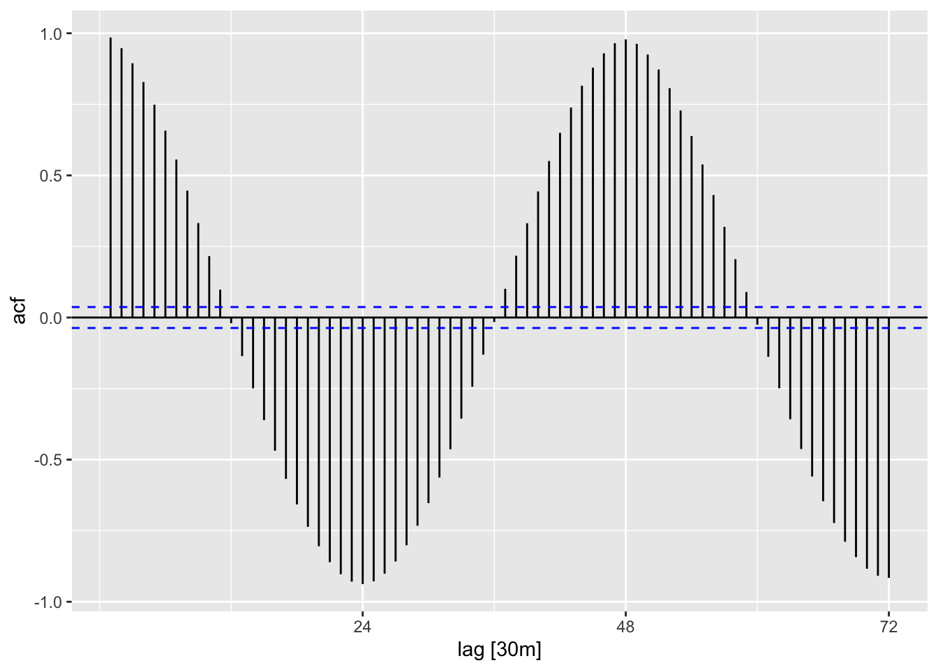
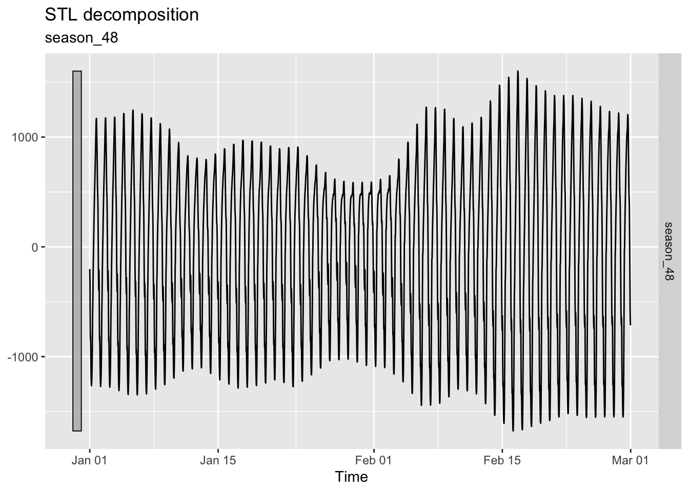
Next, let us consider ACF plots for time series that are dominated by seasonality and by cycles. For the former, we make use of the STL decomposition of vic_elec obtained in Chapter 5.
Figure 6.6: Beer production in Australia between 1976 and 2010.
In Figure 6.6, we have plotted the seasonal component of the decomposition, while Figure 6.5 displays its ACF plot. Notice that ACF plot looks like the graph of a cosine function with period 48. This is no coincidence: Seasonality is reflected in ACF plots as a regular pattern.
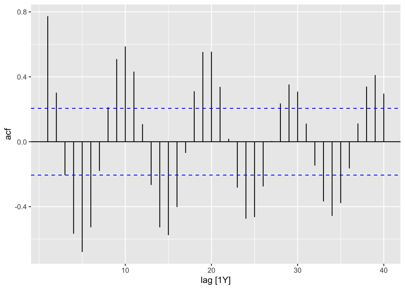
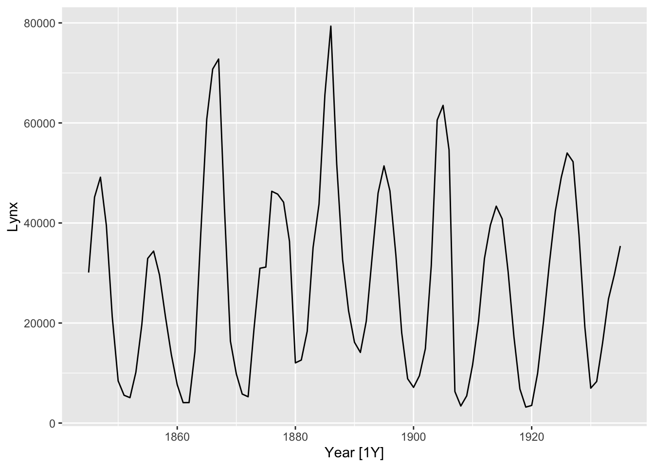
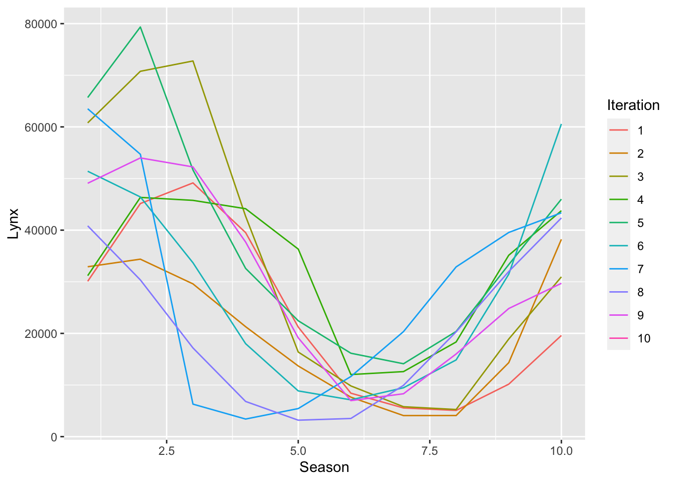
We now show the ACF plot for the Hudson Bay Company trading records for lynx furs, contained in the pelt dataset.
Figure 6.8: Hudson Bay Company trading records for lynx furs.
pelt |>gg_custom_season(Lynx, period =10)
Figure 6.9: Hudson Bay Company trading records for lynx furs.
While the time plot suggests a repeating pattern of period 10, a seasonal plot of pelt reveals that it is unstable, which is more reflective of cycles rather than seasonality. This is reflected in the ACF plot, Figure 6.7, appearing as a damped sinusoidal function.
ACF values can be easily incorporated into the output of features() via the function feat_acf().
Six columns have been generated. What they are is explained in the following excerpt from the documentation of feat_acf describing its output.
A vector of 6 values: first autocorrelation coefficient and sum of squared of first ten autocorrelation coefficients of original series, first-differenced series, and twice-differenced series. For seasonal data, the autocorrelation coefficient at the first seasonal lag is also returned.
6.3 Cross-correlation
We often want to understand the relationships between multiple time series and have learnt about how to do this to some extent using scatterplots. Because of the time element, we should also consider the effects of lags. This information is efficiently summarized using the concepts of cross-covariance and cross-correlation.
Let us denote a second time series by \(y_1,y_2,\ldots,y_n\). The (sample) cross-covariance function of \((x_t)\) and \((y_t)\) is defined as \[
\hat\gamma_{xy}(k) := \frac{1}{n}\sum_{t=k+1}^n(x_t - \bar x)(y_{t-k} - \bar y)
\] for \(k=0,1,\ldots,n-1\). For negative \(k\), we set \(\hat\gamma_{xy}(k) := \hat\gamma_{yx}(-k)\). Note that we do not necessarily have \(\hat\gamma_{xy}(k) = \hat\gamma_{yx}(k)\), so this is no longer an even function.
The (sample) cross-correlation function (CCF) of \((x_t)\) and \((y_t)\) is defined as \[
\hat\rho_{xy}(k) := \frac{\hat\gamma_{xy}(k)}{\sqrt{\hat\gamma_x(0)\hat\gamma_y(0)}}.
\] Like autocorrelation, it is easy to check that \(-1 \leq \hat\rho_{xy}(k) \leq 1\).
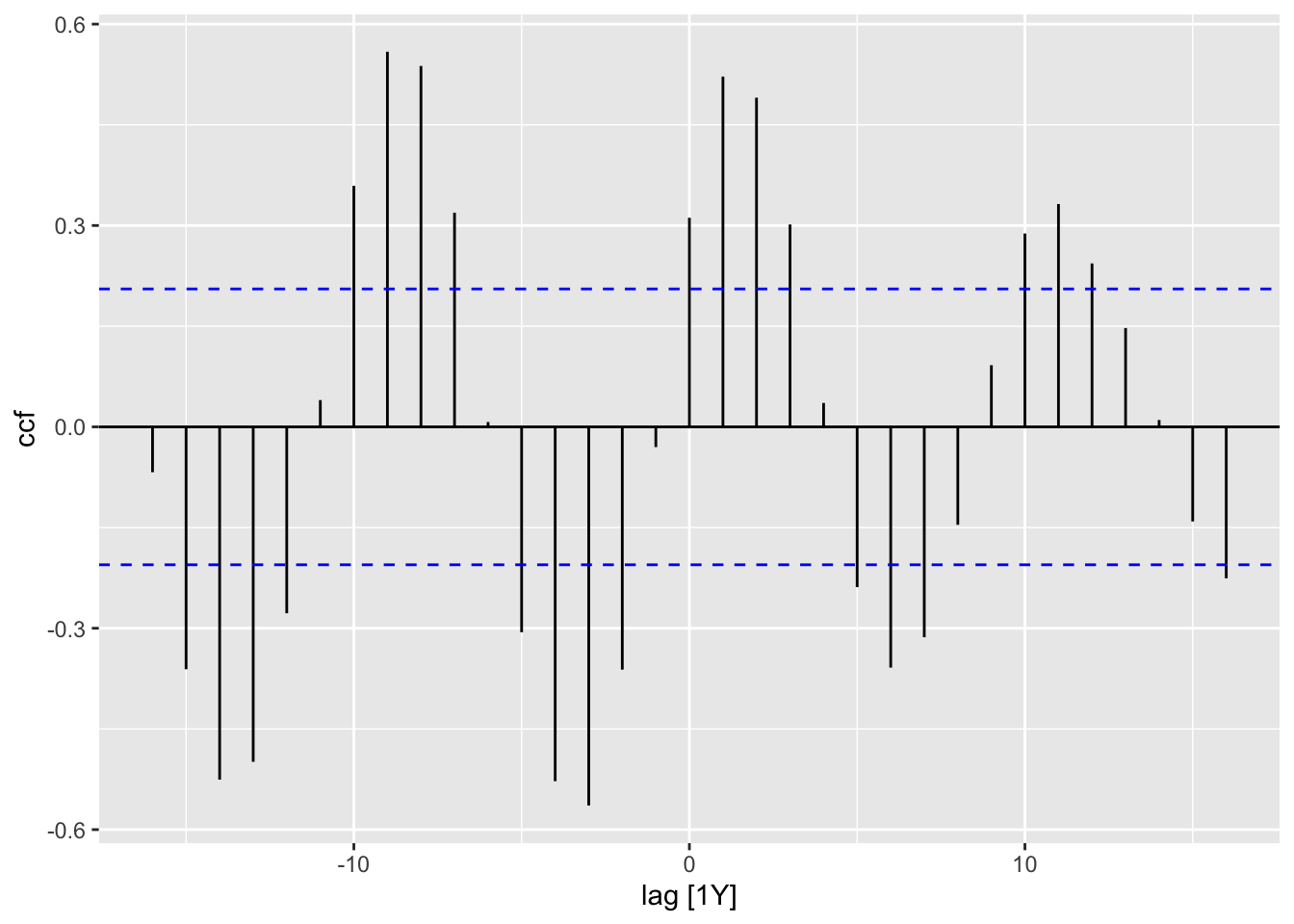
To compute cross-correlation, we can use the CCF() function. Let us apply this to pelt, which contains the Hudson Bay Company trading records for lynx and hare furs between 1845 and 1935.
pelt |>CCF(x = Lynx, y = Hare) |>autoplot()
Figure 6.10: Autocorrelation plot for lynx and hare furs.
The CCF plot has a sinusoidal shape, with the first peak occuring at lag 1. The number of furs being traded can be treated as a proxy for the population size of each animal. Hence, we can interpret this as saying that the lynx population size is most strongly correlated with the hare population size from the previous year, which agrees with existing theories of predator-prey dynamics.1
6.4 Decomposition statistics
In Chapter 5, we learnt about how to decompose time series into trend, seasonal, and remainder components, denoted \(T_t\), \(S_t\), and \(R_t\) respectively. We also learnt about how to visually inspect which component has a larger influence on time series by inspecting the \(y\)-axis of the time plots of the components. We can make this comparison more rigorous by computing variances.
The strenth of trend is defined as \[
F_T := \max\left\lbrace 0, 1 - \frac{\text{Var}(R_t)}{\text{Var}(T_t + R_t)}\right\rbrace.
\] This statistic compares the trend with the remainder component. If the scale of the trend is much larger than the scale of the remainder component, then \(\text{Var}(R_t) \ll \text{Var}(T_t + R_t)\), which implies that \(F_T\) is close to 1. Conversely, if the scale of the remainder component is much larger than that of the trend, \(F_T\) is close to 0. Note the similarity between this definition and that of \(R^2\), the coefficient of determination in regression and analysis of variance.
Analogously, the strength of seasonality is defined as \[
F_S := \max\left\lbrace 0, 1 - \frac{\text{Var}(R_t)}{\text{Var}(S_t + R_t)}\right\rbrace.
\] It has a similar interpretation.
Both of these statistics can be computed using the feat_stl() function.
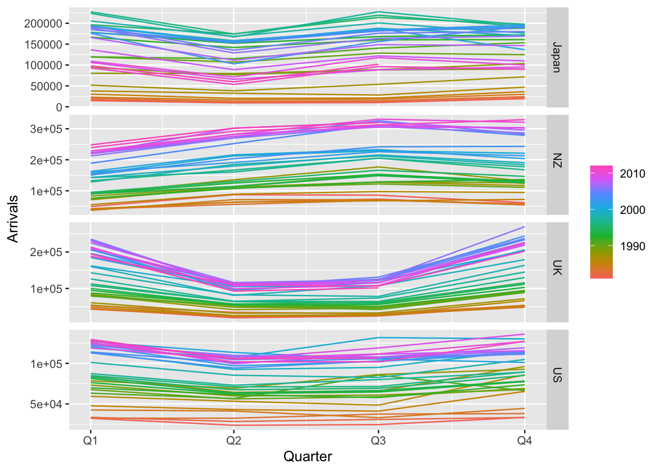
The second and third columns indicate the strength of trend and strength of seasonality respectively. We see that, for all time series in the aus_arrivals dataset, there is a strong trend. On the other hand, the yearly seasonality strength is higher in NZ and UK compared to Japan and US. This agrees with what we observe in the seasonal plot shown below.
aus_arrivals |>gg_season()
Figure 6.11: Seasonal plots for tourist arrivals to Australia.
6.5 Other statistics
There are may other useful statistics that can be computed. One source of useful statistics is combining those that we have seen so far with time series transformations. For instance, first computing standard deviations over a rolling window and then taking the mean gives a summary of how volatile the time series is.
Indeed, the following code snippet generates 47(!) different summary statistics. We refer the reader to Chapters 4.4 and 4.5. in Hyndman and Athanasopoulos (2018) for more details on these statistics as well as how they may be used.2
Hyndman, Rob J, and George Athanasopoulos. 2018. Forecasting: Principles and Practice. OTexts.
This can be modeled using ODEs. See also https://jckantor.github.io/CBE30338/02.05-Hare-and-Lynx-Population-Dynamics.html. A more sophisticated approach would make use of state space models.↩︎
Some of these summary statistics, such as tests for stationarity, will be discussed in part 2 of this book.↩︎